Inpatient progress note redesign: solving ‘note bloat’
Client: UVM Medical Center • 2015-2016 • Role: Lead Designer
Challenge
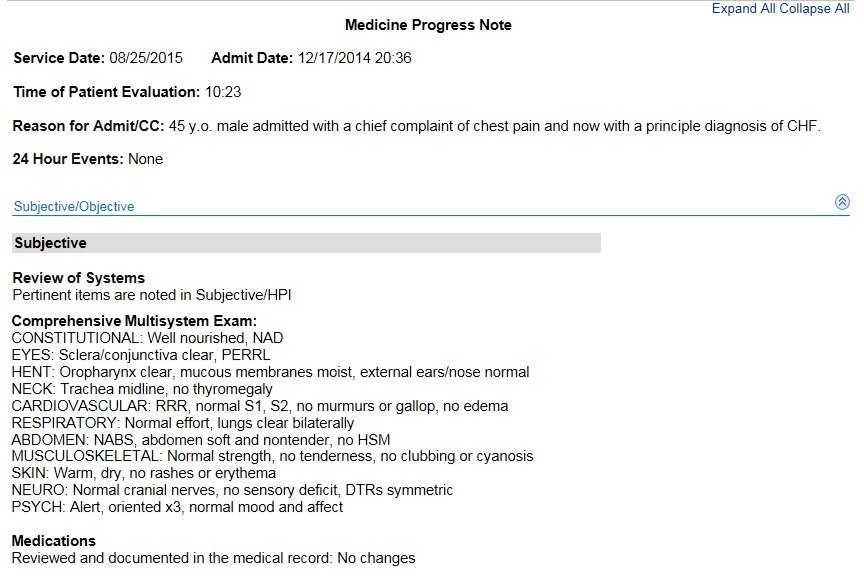
Like many hospitals, the UVM Medical Center has struggled with unwieldy inpatient progress notes. These are the notes that doctors write about you for each day that you’re in the hospital; they are intended to be a communication tool for the care team. But they suffer from a severe case of TMI. Clinicians copy and paste information from day to day (up to 70% of information in the note is copied and pasted from prior notes;) eventually it’s hard to extract any clinical meaning. This problem is widespread, and it even has the name “note bloat.” As a result of this issue, doctors commonly create their own progress note template, which has resulted in pervasive formatting inconsistencies.
Our goals for this project: to help people more quickly get clinically meaningful information from notes, make reading (and writing) notes less painful, create a note template that doctors would want to use, and ultimately improve patient care and outcomes.
This project may appear dry on the surface, but it was incredibly exciting!
Team
I led design on this project, and collaborated at different times with doctors, residents, other clinical folks who had an interest in seeing this project succeed, and especially Jillian Charles, an Epic analyst who became my fabulous design partner.
Process
Literature review
To start, we reviewed academic papers and other published best practices. In addition to general findings from other hospitals’ attempts at improving their own notes, we learned some best practices and guidelines for writing a better note – such as ‘demonstrate diagnostic thinking,’ ‘highlight what’s changed,’ and ‘tell the patient’s unique story.’
Design research: a.k.a., ‘detective work’
Starting with a limited scope of just Internal medicine and Pediatrics, we did interviews and observation sessions with residents, who write the bulk of inpatient progress notes. We asked them what’s good and bad about the current note templates, what part of the note is most important, and why they created their own templates.
We also spoke with other departments and stakeholders across the hospital to understand their roles and concerns and gather enough information to build a more holistic picture of the progress note ecosystem. We met with the billing and coding folks, who are responsible for using progress notes to generate the appropriate types of bills; we asked about billing requirements, learned about their process, and uncovered reasons why they might flag a note as being insufficient. We also met with attending physicians, compliance, training, and more.
Importantly, this research was not a ‘top-down’ approach – we spoke with important stakeholders throughout the reporting hierarchy. That might seem natural to other designers, but it was somewhat novel in this hospital’s structure and culture. It was different from the way things were usually done on projects.
Developing and visualizing findings
As always, we learned invaluable information from the people we met with. We gained a better understanding of how progress notes flow through the system and are reviewed and ‘signed off’ on at various points:
We learned about the different people involved; their questions and concerns, and opportunities for improving their experience:
We also discovered detailed information about the current note template, such as aspects of the note that people do or do not like, what information is most important, etc; we mapped this out visually.
Visualzing information helped us get the team on the same page, work through what we’d learned and make sense of it, and start to see patterns in complex information.
Some important things we learned:
The most important information in progress notes tended to be at the bottom, and scrolling down to this info was difficult.
Billing requirements were unclear; residents tended to include as much information in notes as they could in an effort to avoid being admonished by the billing and coding representatives.
Large amounts of data are often included in notes that are not helpful for note ‘readers’ – things like lab results and medication lists may be helpful for the writer of the note, but that information is most reliable elsewhere in teh patient record. And, contrary to what many residents thought, this information is not needed for billing purposes.
Prototyping and testing
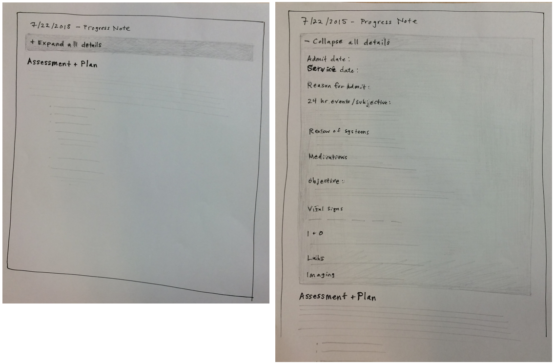
First, I had a chance to sketch out potential solutions with residents in 1-on-1 meetings. One of the initial meetings included this sketch, of a ‘collapsing’ note that showed only the most important information by default, with the rest available with one click.
Early sketches
This idea seemed to have promise when we showed it to other stakeholders, so Jillian and I jumped into prototyping in the medical record. We mocked up an interactive version and had a number of residents test it and give us feedback.
We made a clickable prototype to show the note open and collapsed
Finally, we created a ‘sidebar’ that showed note-writers some commonly-needed data points, like lab results and medications, so that they would not feel the need to include this data in the note itself.
Roll-out
After careful testing, vetting and revisions, we slowly rolled the note out to different services. It was vital that we maintained good communication and relationships with the services as we went through this process; chief residents were a huge help, as well as chief attendings. They helped sell the project, get everyone on board, and set up informational sessions where we could introduce the project and take questions. Jillian really took the lead on this phase, and may I say she slayed it.
Outcome
Through this process we identified and tracked measures of success. In internal medicine, usage of the new note spiked to almost 90% just after roll-out and then dropped a little bit due to resident turnover. This speaks to the importance of ongoing communication about the benefits of using this note.
One key stat demonstrates the this project’s impact on note bloat:
On average, there were 24% fewer characters in the new note as compared to the old note.
If our goal is to reduce bloat and increase clinical meaning, clearing out some excess and redundant information helps get us there.
Feedback from doctors:
“This new note template rollout was the best I’ve experienced.” (–Chief Medicine Hospitalist)
“The note format looks great. It seems to be well received by my medicine colleagues. I appreciated being included in the project.” (–Medicine Resident who helped with initial sketches)
Jillian and I and the greater team really enjoyed working on this important project, and the two of us had a chance to co-present the work at a conference in 2016. Hopefully projects like this will ultimately lead to a better experience for doctors, reduce burnout, and increase the amount of time they can spend doing what they love.


