New cancer patient orientation guide
Client: UVM Medical Center • 2016 • My role: Human-Centered Design, strategy, writing, production, user testing
Challenge
The UVM Cancer Center knew that they needed a new approach to providing information for patients who have just been diagnosed. They had spent months having internal meetings with leadership about what to include, and they had created a rough draft that included things like a letter from the director and treatment options. The team determined that they needed to get more insights from patients to create truly patient-oriented information.
Team
I led all design and writing on this project and collaborated with Marketing Strategist Gina Brittain.
Process
Patient workshop
We planned a workshop with 4 patients who were either currently receiving treatment or in remission. We planned two key exercises with them: one where they would write words and shapes on a timeline to reflect how they felt and what they did during their cancer journey, and another simple content prioritization exercise.
The beautiful timeline worksheet that did not get used.
We learned very quickly that the group’s expectations had not been adequately set – two of them had such severe neuropathy from chemotherapy that they couldn’t use scissors and got angry that we were asking them to cut things out. So we had to think fast; what started as an interactive exercise ended up with me at the board recreating the journey map outline and prompting them while capturing their conversation. It was a small group, so everyone had a chance to talk, and it was very emotional.
Workshop Insights
What we learned: patients’ biggest need at the time of diagnosis was emotional reassurance. They didn’t care about a note from the director, and they didn’t want to be flooded with information and treatment options. They especially didn’t like being loaded down with lots of brochures and heavy binders. It was important for them to feel like the cancer center was there for them, and that the staff would be working together as a team.
I put together a report that included illustrations of some of the key findings, and presented it to the Cancer Center team. Here are some of the illustrations:
Newly diagnosed patients are unable to absorb much information
It’s hard to imagine what’s going to happen.
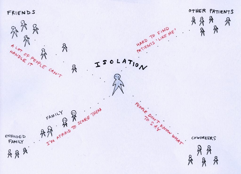
Patients feel isolated; there are specific problems relating to different groups of people.
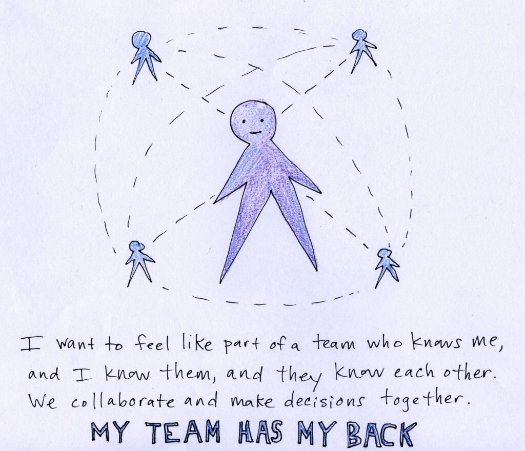
Patients want to feel like part of a team.
Staff interviews
I met with a number of diverse patient-facing staff in the Cancer Center: nurse navigators, social workers, the American Cancer Society navigator, schedulers, intake coordinators, counselors, and nurses. Through these meetings I learned about their different roles and how they support patients.
Design Principles
We put together design principles to help guide our writing and content; these came directly out of our patient workshop:
Focus on emotional and psychosocial support for patients with a new diagnosis (decreasing stress and fear) more than being a comprehensive informational guide: “Write this in such a way that the purpose is to help allay their fears instead of giving them a lot of information.” – a patient
Limit information provided to the basics, with a way to get more as needed
Be brief; do not overwhelm. Patients’ capacity to consume information will increase over time. In the very beginning they are in shock.
Use plain language, write to a low reading level
Avoid promotional language, and focus instead of supporting that patient’s needs in that moment
Use appropriate imagery that is sensitive to the difficult news patients are receiving.
Form factor: consider creating a smaller piece that might fit in a small bag or purse.
Based on what we heard from patients, I also made recommendations for specific emotional messages (like “Your cancer does not define you; you are not your cancer.”) and content (like “Tips from Patients.”)
Prototyping
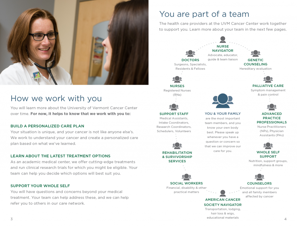
As a result of the insight we gained from patients, we completely changed the format and information of the guide – we made it smaller so it would fit in most purses, and we stripped out a lot of the information that was originally planned for it. We aimed for emotional reassurance, and one of our original patient participants wrote a short letter of introduction. Here are some sample pages:
We put a strong emphasis on teamwork and patient-centeredness.
The guide aims to help reduce stress by setting expectations and giving ‘just enough’ information.
One innovation in this guide was to flip the way we talk about resources for patients. While prior versions of the guide had organized support resources by which ‘role’ in the organization provided them (for example: hair loss support would be listed under American Cancer Society Navigator), in this version we extracted these types of needs and concerns and organized them by topic. These helped us move away from an organization focus and toward a patient-oriented mindset.
Topic-based organization instead of staff role-based organization.
Testing with patients in chemo infusion area
Once we had a draft together, we took it to the chemo infusion area and sat with 4 patients who offered to review a draft while receiving their treatment. The feedback was universally positive:
“It’s calm and reassuring. The tone is clear, clean, and it’s not overwhelming.”
“I like that it’s not too big and bulky, and that it’s not a heavy binder. A person might actually read it.”
“I’ve got to hand it to you. This is better than anything I’ve seen. It’s detailed, but also generalized. I don’t see it as scary or intimidating.”
Outcome
This was a special project. Our patients from the workshop felt listened to, and they felt good about helping other patients like them. Our Cancer Center leadership learned a lot about what matters to patients, even though that was at first difficult for them to accept.
Most importantly, the new patient guide is still in circulation and is being regularly maintained.


