
Children’s mental health assessment tool: product + UX
Client: Child Mind Institute • 3/2023-1/2024 • My role: Lead UX person, Product Management helper
Challenge
Child Mind Institute, a children’s mental health non-profit, needed to improve its mental health assessment product, MindLogger. The admin side of the product was complex, and it had a poor user experience.
Goals of the Mindlogger product work:
Improve both admin and patient-facing product UX
Build a human-centered strategy, based on user insights
Organize, articulate and phase upcoming features
I worked with this team for almost a year, and in that time we accomplished a lot. As you will see, much of this work entailed organizing information, planning, and creating order from chaos. My sweet spot!
Team
My role was a blend of user research, product/UX design, and product management. Or, as I like to say, the Back of Design. Our team was comprised of:
Head of product
Design collaborators
Head of data science
Offshore product development team (I worked directly with business analysts, developers)
Discovery
I conducted 35 Interviews & usability tests in the first couple months. The usability tests were conducted using admin app prototypes created by me and other design team members.
Research goals
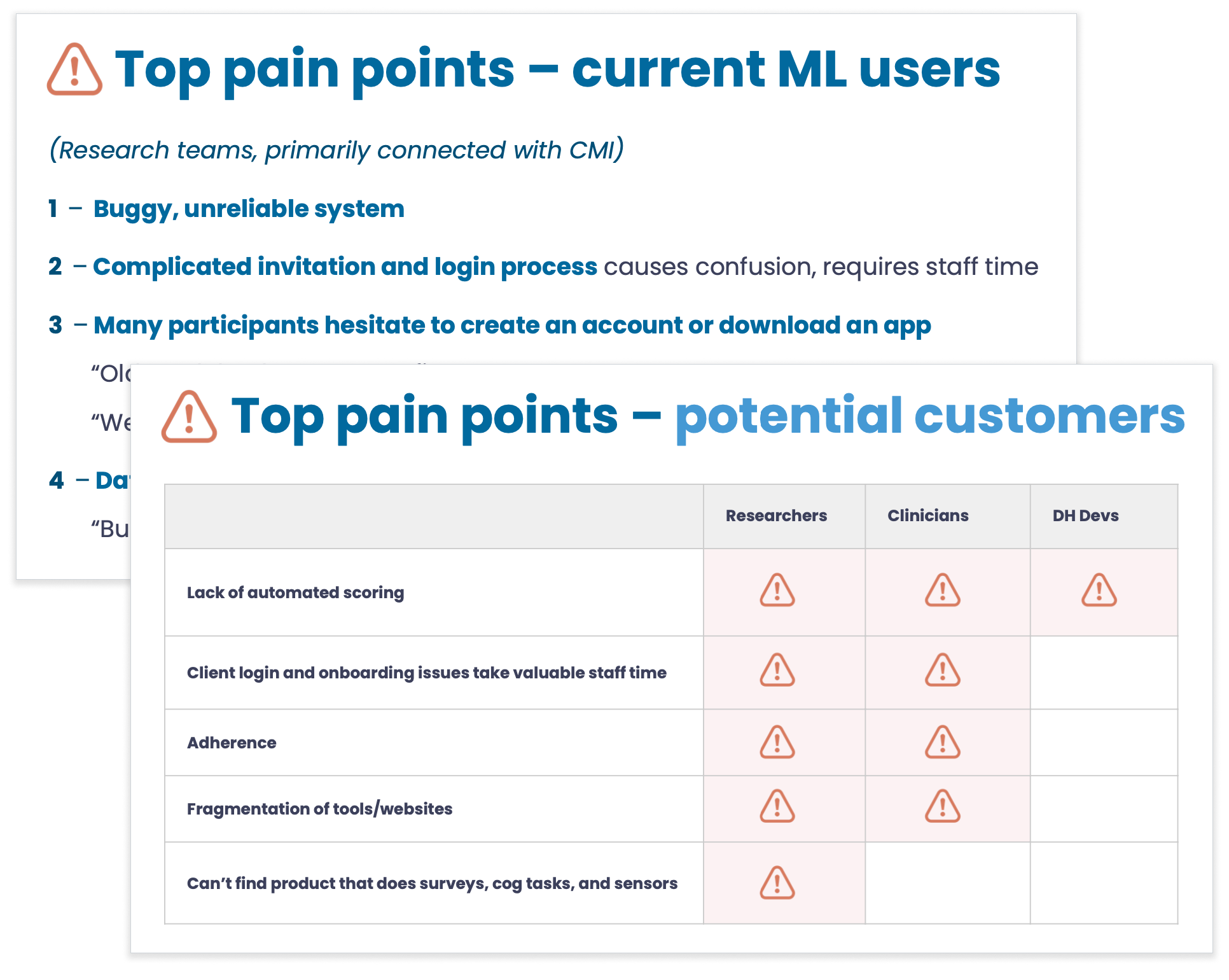
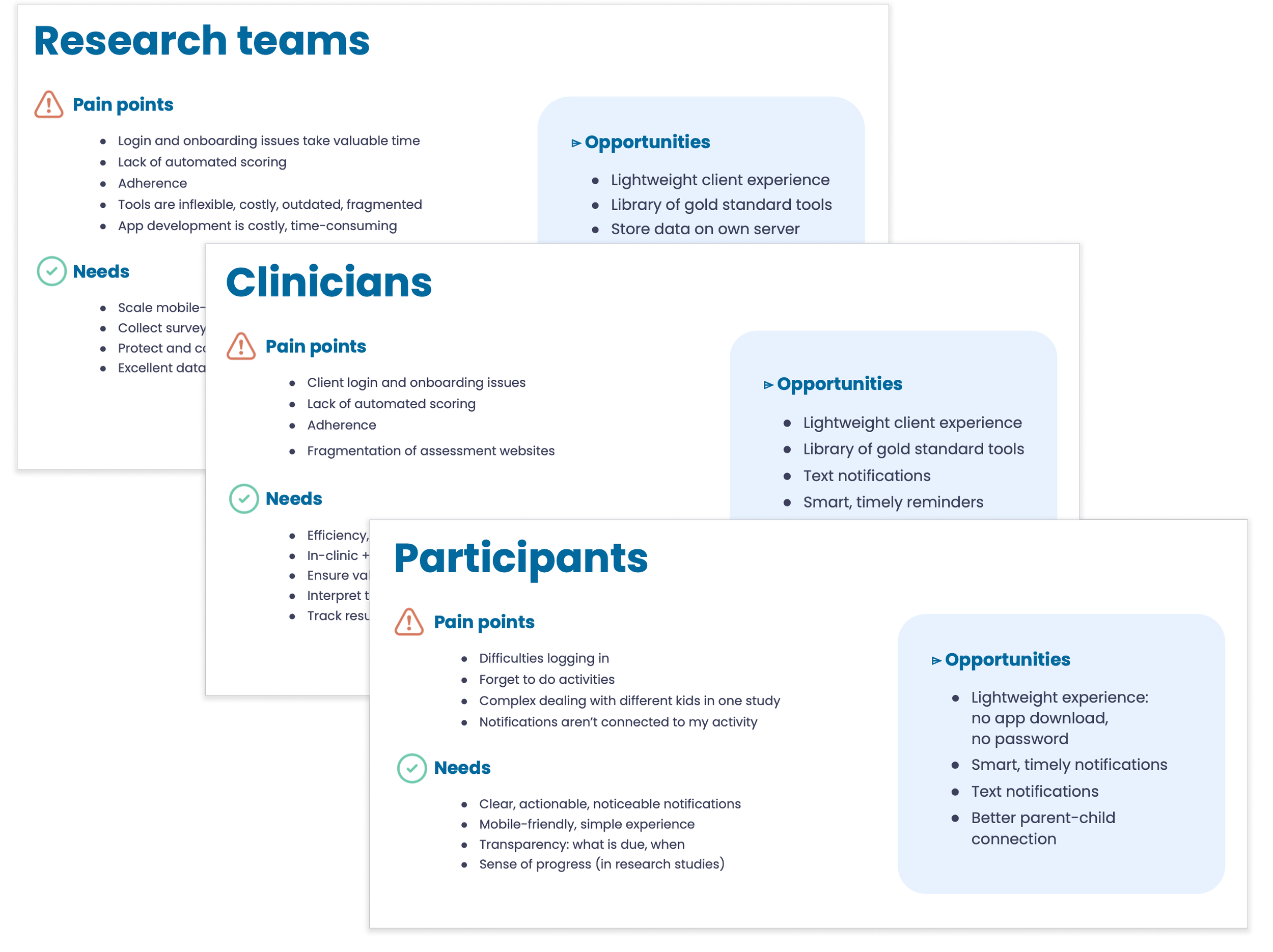
Understand potential customers’ and users’ needs/priorities
Understand current MindLogger users’ needs/priorities
Gain insight to help us prioritize customers and features
Seek opportunities to focus and simplify
Develop a vision for a product that can gain traction in the market
Users
18 internal users and stakeholders
9 external clinicians
4 external researchers
4 people from digital health companies
First level synthesis
I organized detailed feedback for our internal team.
Read-out to larger team and leadership
Along with the head of product, I created a presentation to bring to life pain points, needs and opportunities for our potential audiences.
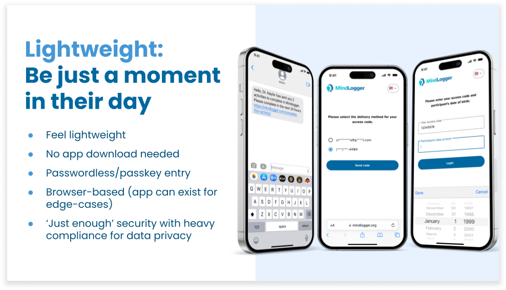
Design principles
The best design principles help us make decisions and prioritize features. After our discovery process we developed a few key principles; one of the most important is below.
Outcome from discovery: this work helped us prioritize features, develop our roadmap, and it gave us some clues about which business case would be most fruitful.
Product planning & management
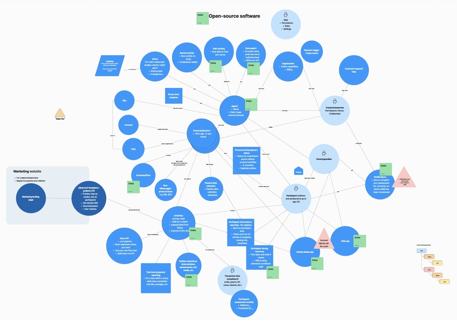
Concept mapping
I facilitated sessions with the team to put together a diagram of the ‘nouns’ of this system and how they related to each other. This helped us kick off our product work with a holistic and shared view of the system.
Story mapping
Inspired by Marty Cagan’s book Inspired, I created and maintained a story map in Miro. This was an attempt to map out features, high-level, so we could design and ship more quickly. The features outlined came primarily from our discovery work.
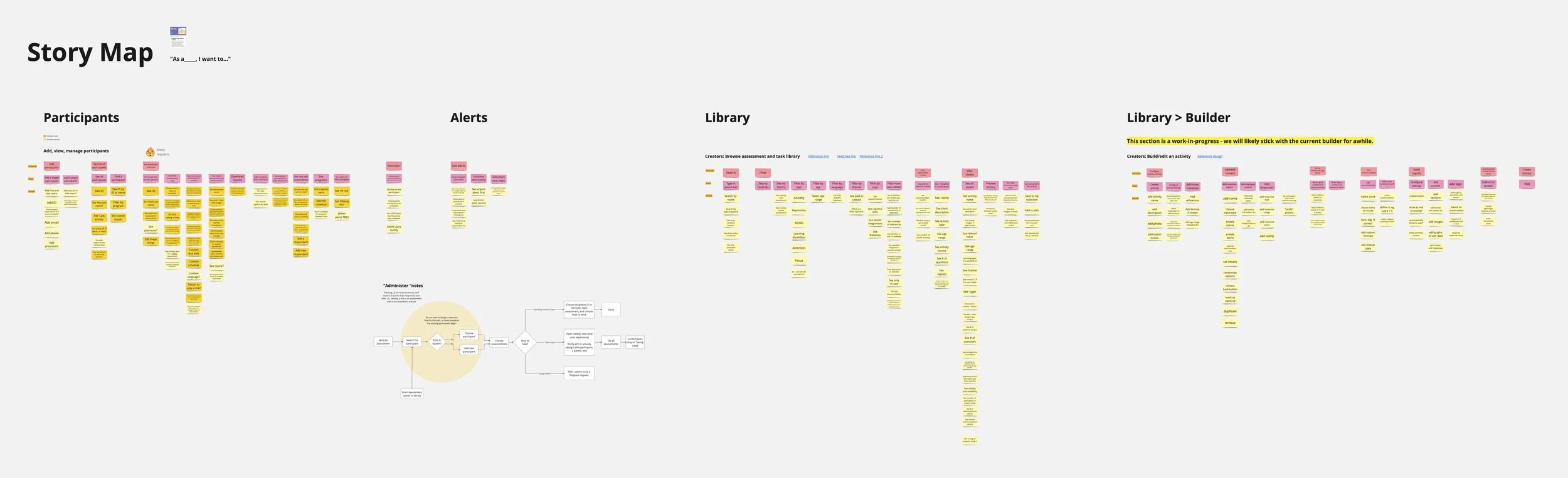
The story map eventually was put aside in favor of a mix of Confluence and Google Drive. But this helped us wrap our minds around the work (and jobs) to be done.
Feature briefs
I wrote crisp, clear feature and product briefs, to communicate design and functionality. These were always paired with a design prototype. I’d be happy to share samples - just ask.
Diagrams to keep us on the same page
Using a combo of Miro and Figjam, I modeled ideas for how the product could improve. For example, we knew our admin app navigation had problems. I maintained a sitemap for a potential new navigation scheme, to set us up for an eventual redesign.
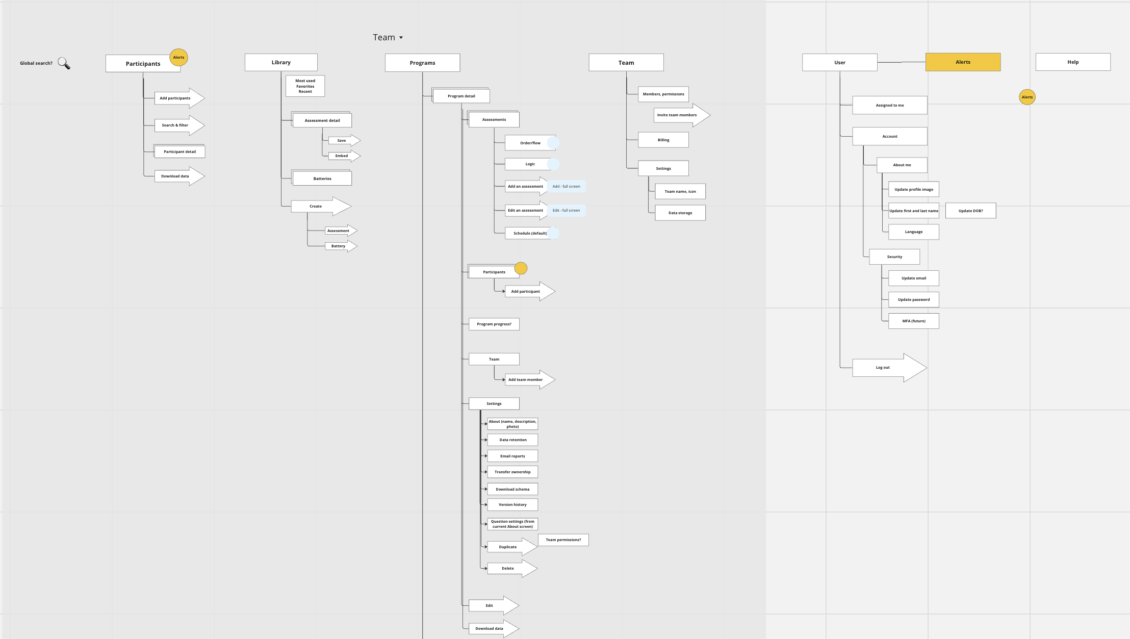
What was different about this sitemap? Among other things:
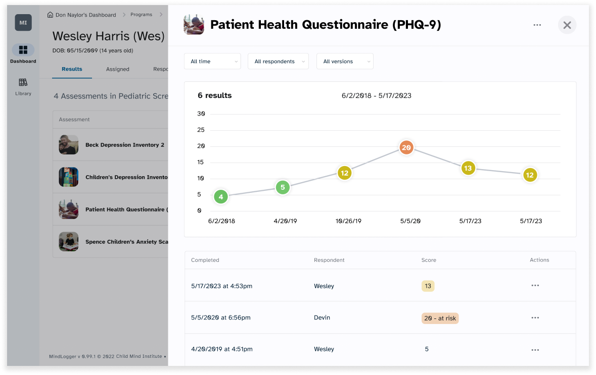
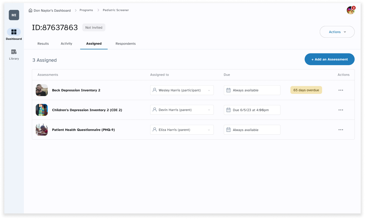
We added a participant view. One challenge about the way the original product was built was that there was no ‘participant-centric view’ - no way to pull together all of the assessments taken by a given participant. So we added this to our sitemap and later to our designs.
New terminology: the existing product used the term ‘applet’ to mean a grouping of assessments. We tested different terms, like Program, which are more commonly understood.
A place to manage the team, separately from the program. We brought the concept of ‘team’ up to the higher level, so that the team could collaborate on multiple ‘programs,’ as was often needed.
I also created a feature dependency map to help visualize feature dependencies, so we could better see ‘what unlocks what.’
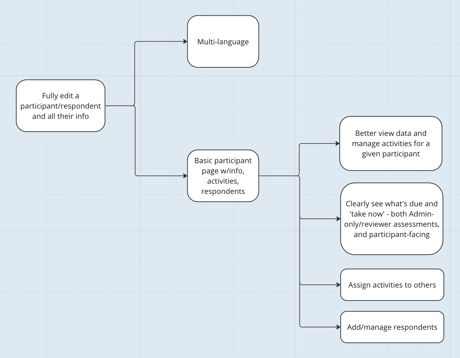
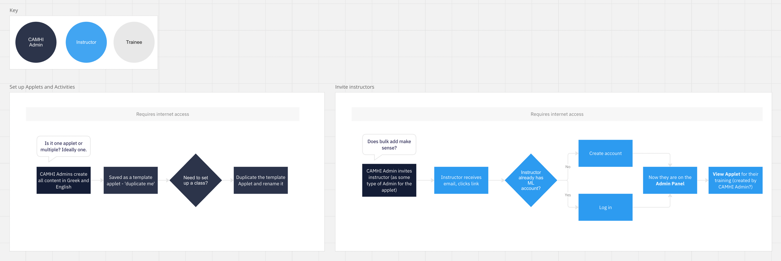
I mapped out user journeys and task flows to show different roles’ paths through the system. Here’s an excerpt. Visualizing information is fun, and it always helps teams work together better.
Product design lead(ership)

I served as a player-coach design lead:
Organized and managed design team work (using Monday.com), led weekly design standups
Mentored junior designer
Tightly collaborated with our other UI designer
Led the “deep thinking” part of design on features spanning admin app, web app and mobile app
Managed ongoing research, collaborating with users and stakeholders (especially clinicians, researchers and research assistants.)
A couple mini-case studies are below.
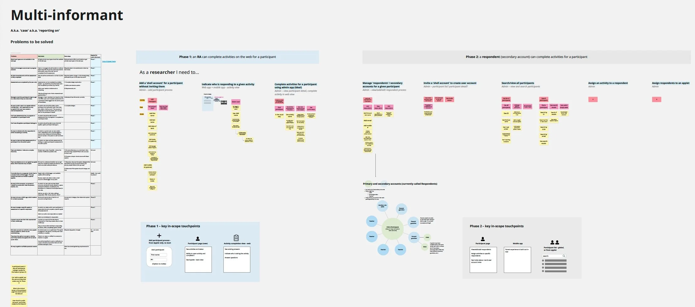
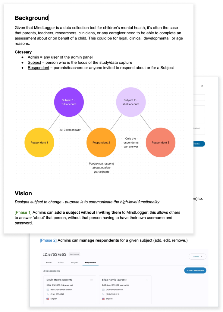
Feature development: ‘multi-informant’
In the mental health assessment world, it’s important for other people (parents, teachers, etc.) to be able to answer assessments for a given kid. I helped to scope, define, phase, and design this feature, which primarily lived in the Admin app.
Map out the problem
In Miro, I collaborated with team members to understand the problem(s) we were trying to solve and create a high-level ‘story map’ of in-scope features.
Design prototypes & testing
In this team, I tended to create a first version of a prototype, and then another design team member would refine the visuals. We did multiple rounds of testing these prototypes with current and prospective users.

Vision brief, feature briefs
In addition to maintaining a prototype, I created a Vision document to orient people to the higher-level work. I also created refined briefs, to describe the work to be done.
As I left the team, this development team was starting this work.
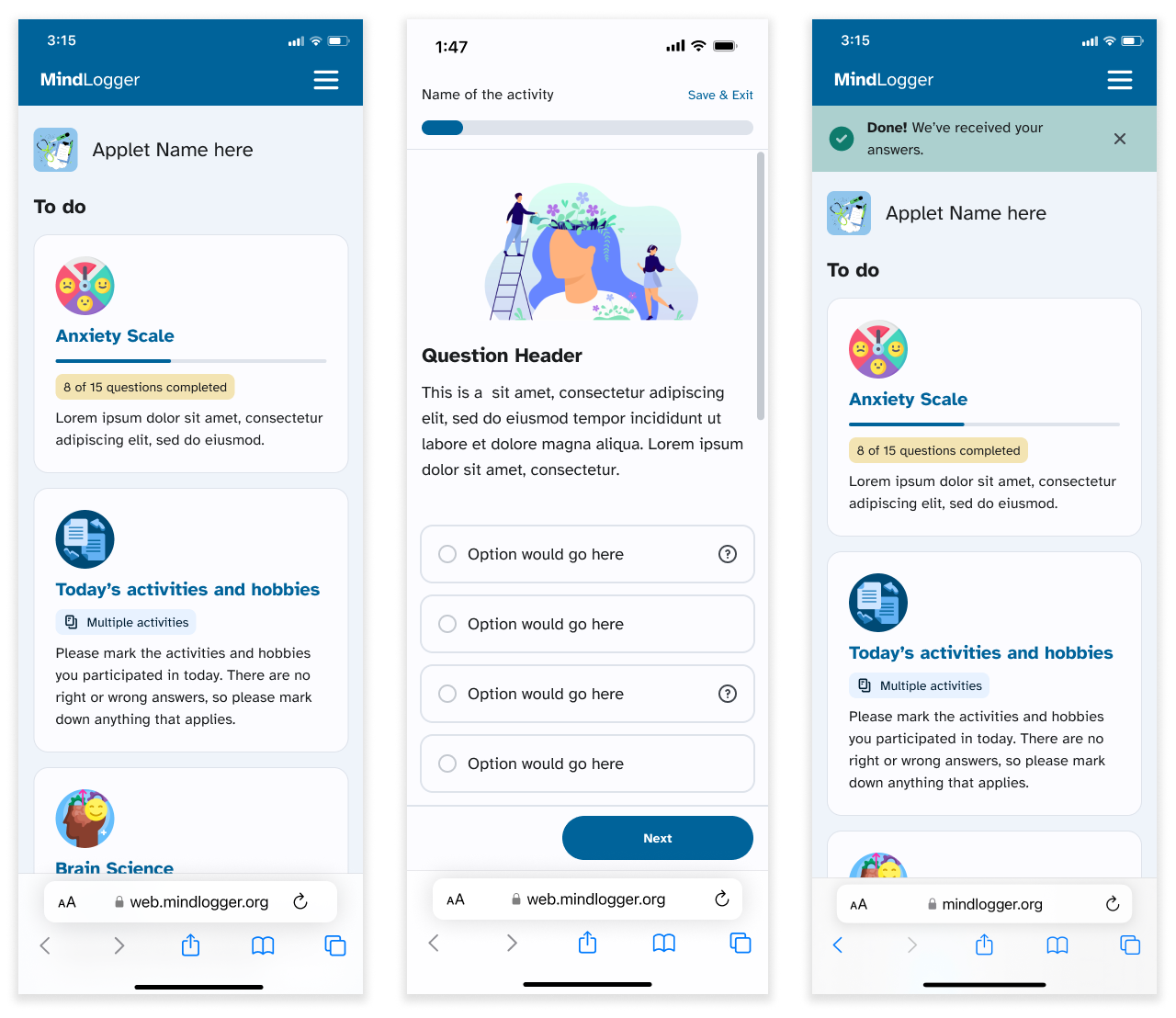
Patient-facing web app overhaul
To support our top principle of being ‘Lightweight,’ we needed to optimize our web-based experience, so that users would not always have to download an app. The existing web app had a clunky user experience and was almost impossible to use.
UX audit
Together with designer and team member Don, I mapped out the current pain points of the web app.
Design
I tracked requirements, sketched ideas, and collaborated with our team’s UI designers to design and prototype the refreshed web app. My focus here was on words, usability, and clarity.
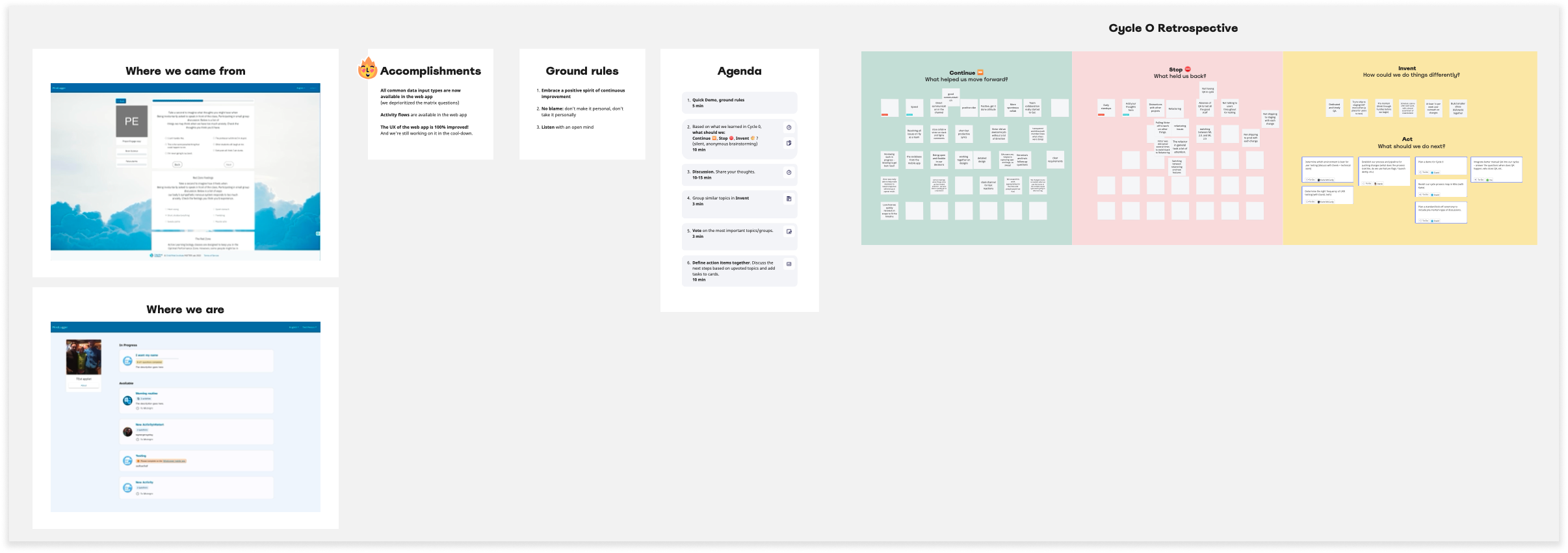
QA, launch, and retrospective facilitation
Along with the business analyst from our offshore dev partner, I helped QA and log issues. Once we launched, I facilitated a typical ‘start-stop-continue’ retrospective with our core team, using Miro; we felt proud of the work we’d done, and we were excited to figure out how to improve our process moving forward.
Beta & usability testing
During all of this, the technical team was working on a complete refactor of the code base and design.
I moderated 14 sessions prior to the admin app refactor release with 11 unique Admin users (some multiple times): 8 current and 3 prospective users.
Goals: verify data and do some usability testing on the new Admin panel.
Recap of top issues across all user research so far
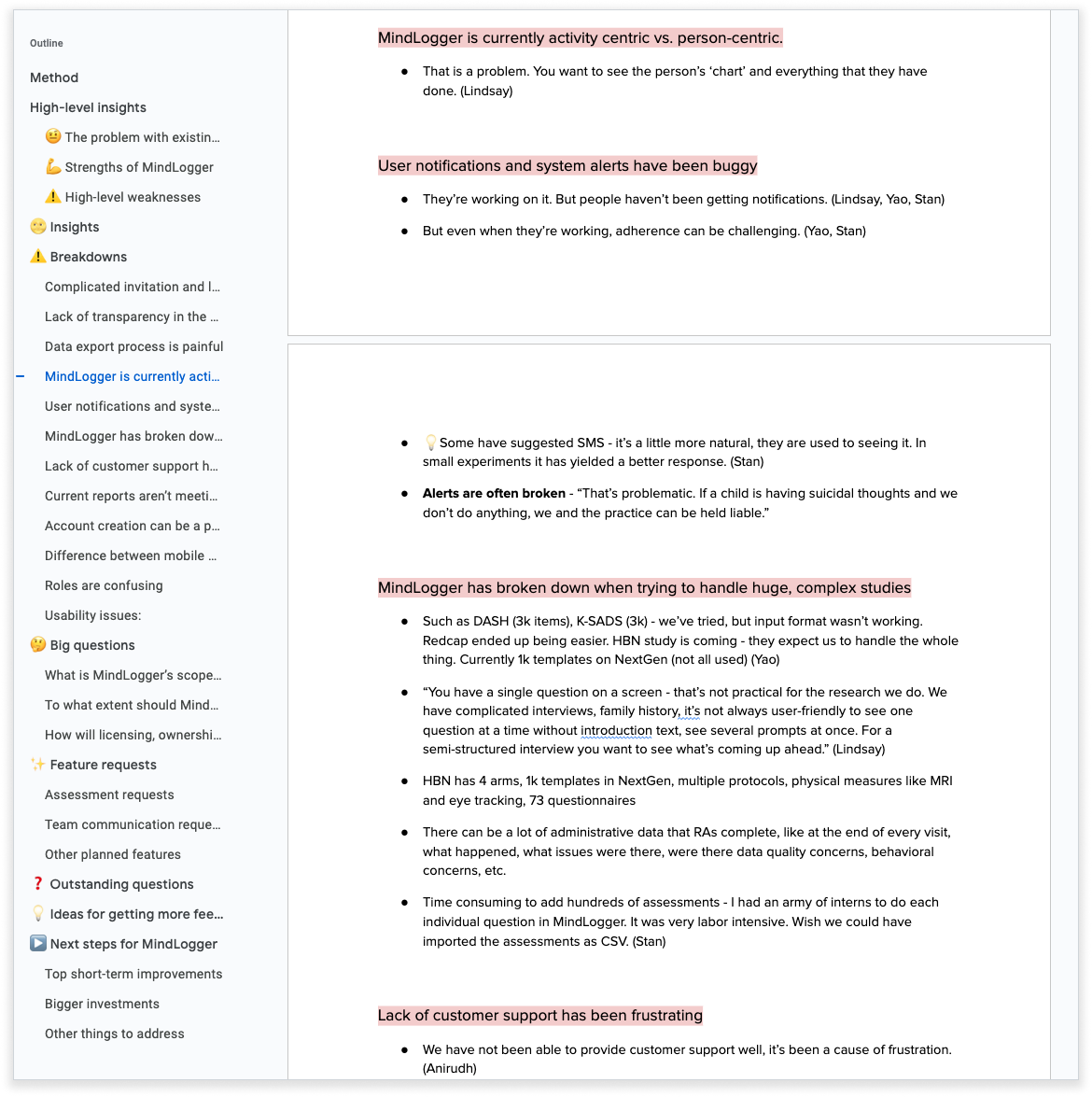
Because I had conducted the original discovery sessions, and we had a number of new team members, I created a document outlining top issues and feedback across all sessions. This document served as a map and linked off to more detailed findings. I presented this to product, engineering, and leadership team members. Here is an excerpt:

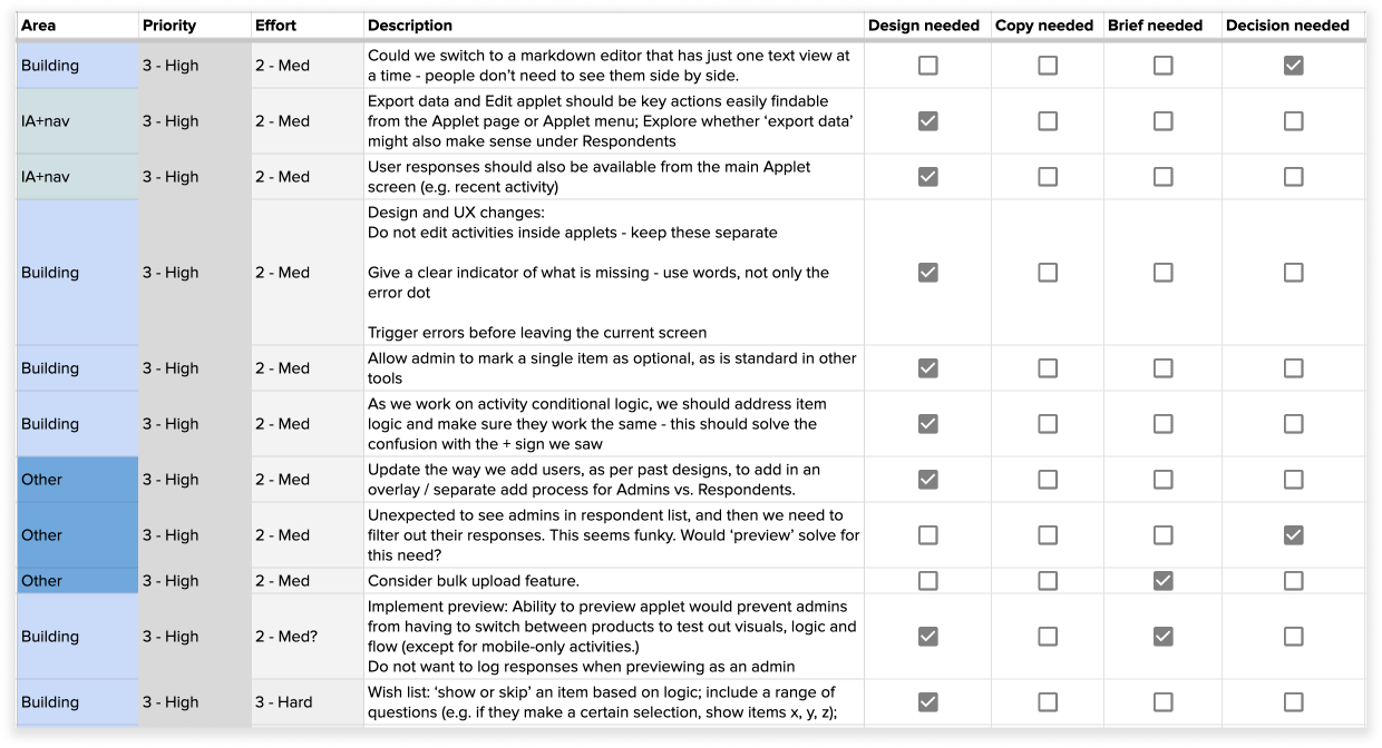
Detailed issues to solve
I also created a spreadsheet with all the detailed issues to be addressed, so that we would not lose track of them. I like to let my Type A tendencies run wild sometimes; I call it “releasing the beast.”
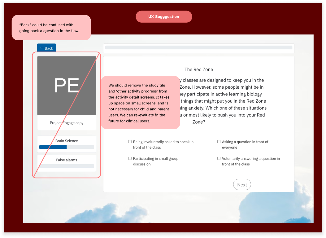
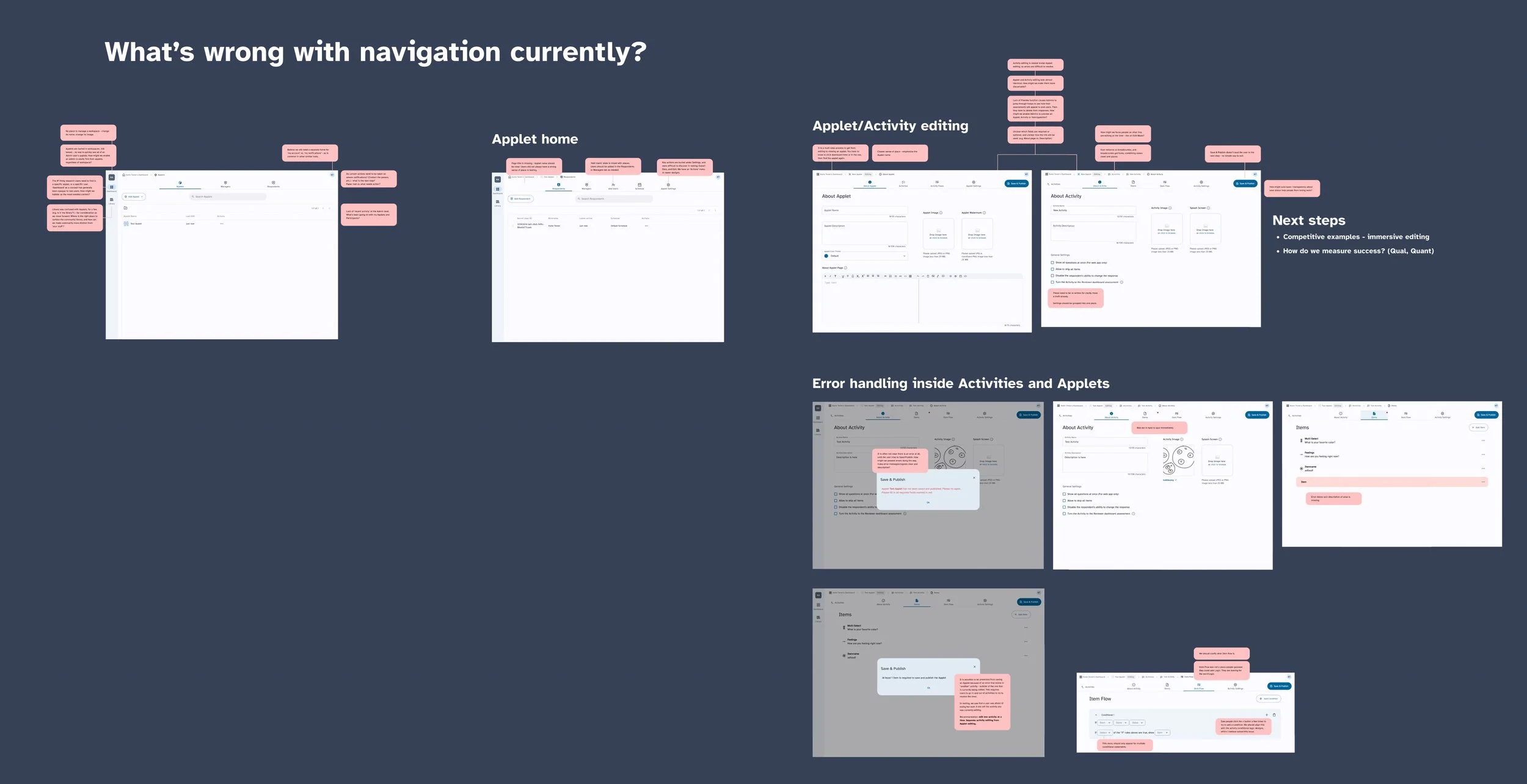
Visual map of UX issues
I mapped out the key issues we saw in testing, to help other designers on the team understand exactly what was wrong. One big pain area was navigation in the Admin app, and as I departed, this was one of the next important areas to address.
Outcome
Here’s how my contribution helped further the team’s goals:
Improve product UX
I helped discover, design, and prioritize future improvements for the Admin panel - such as multi-informant feature and a navigation overhaul.
My team designed, built and launched a much more usable web app
Build a human-centered strategy, based on user insights
I conducted 45 test sessions and interviews, and distilled findings into 1) actionable insights for design, and 2) prioritized product improvements
I maintained relationships with users over time, and collected informal insights outside of scheduled sessions
Organize, articulate and phase upcoming features
I led the multi-informant feature push, as lead designer and stand-in PM; I maintained prototypes and briefs, and presented the work across teams.
I wrote many detailed feature briefs, helped maintain our product roadmap, and communicated/collaborated with the greater team to keep folks aligned
As one colleague said, “you’re an ally in the fight against entropy.” I was happy to support this team, and I know they will go on to do good work.