Spotlight: Clinical collaboration on digital tools
As an extrovert who loves working with smart people to solve hard problems, I crave creative collaboration. Over 10+ years working in healthcare UX and product, I’ve had the honor to listen to, learn from, and meld minds with some brilliant and interesting clinicians.
Here are some snippets from various projects.
Health coaching startup: onboarding & client management tool
2021-2022 • Mymee • Role: Lead Product Designer and Researcher
Collaboration with: health coaches, staff naturopath, staff rheumatologist
Startup Mymee helps people with autoimmune conditions reduce their symptoms by pinpointing the specific things that make them feel worse or better. I was an early beta tester in 2012, and had the pleasure of working with this team from 2021-2022 as a lead designer and researcher. While helping to design and launch patient-facing features for mobile and web, I also led design on an initiative to create a patient management web application for health coaches, and to figure out how to more seamlessly onboard new clients into the program.
Clinical collaboration looked like:
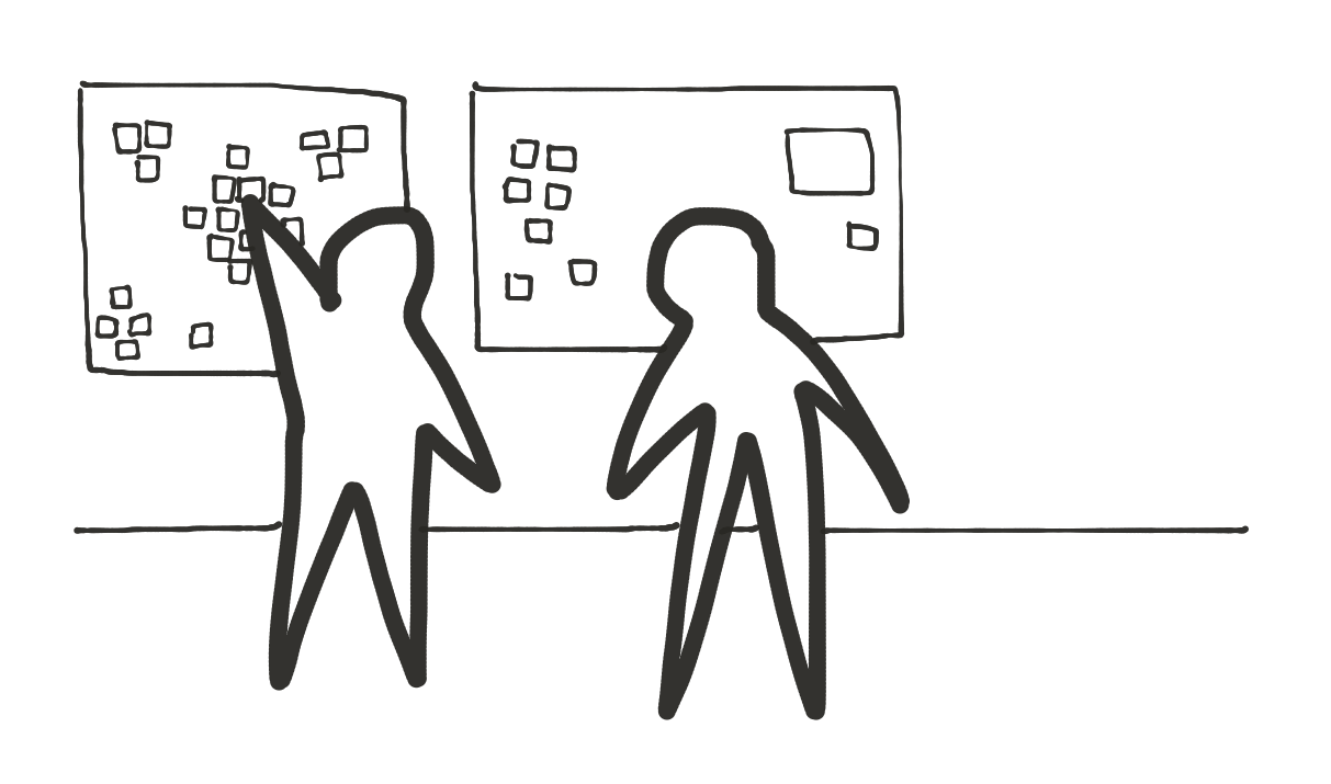
Requirement gathering with health coaches and other clinical team members
I picked up where another team member left off, organizing requirements and meeting with health coaches to confirm their needs.
I met with the staff rheumatologist and naturopath many times to understand how we measure success and outcomes, and to ensure these data points were being gathered.
Being a client myself
Everyone at the company was able to receive health coaching, so I took advantage of this offer. While a client, I discovered ways of organizing my own information that helped me communicate better with my coach, and helped my coach track me over time. Some of these ideas made it into our design.
1-on-1 usability testing and feedback sessions
I collaborated heavily with my design parter Patricia on prototype creation, and I then tested our prototype in 1-on-1 remote sessions with coaches, giving them control of my screen so that they could explore the prototype.
Group feedback sessions
Finally, I attended the coaches’ weekly meeting many times to review and vet prototypes, ask questions, and make sure we were heading in the right direction.
Outcome
We learned through this process just how important it is to balance data input / ‘data completeness’ with user experience, and we tried to walk that line carefully throughout this project. The outcome of this work is uncertain as I have moved on from the team, but I enjoyed collaborating with them throughout the process.
Linq: remote monitoring for digital health data
2014-2015 • Open mHealth • Role: Lead Designer and Researcher
Collaboration with: Cofounder Dr. Ida Sim, Stanford Preventative Cardiology doctors and nurses, cardiac rehab counselors, and patients (as always)
On this small but mighty team, we worked to incorporate digital health data into a clinical setting and make it more useful and user-friendly for doctors and patients.
Vision and insight from our team’s clinican
This work was the vision of cofounder and internal medicine doctor Ida Sim, with whom I was able to meet frequently.
Interviews with doctors, nurses, and cardiac rehab counselors
As part of my initial research, I spoke with cardiology doctors, nurses, rehab counselors, and eight patients – especially focusing on the patient experience to understand the emotional concerns around the time of diagnosis and the ‘daily routine’ of managing a heart condition.
Usability testing (and pilot planning) with Stanford Preventative Cardiology
I also did usability testing sessions with prototypes I had developed with 4 Stanford cardiologists. We also were planning a pilot with this clinic.
Key insights
Clinicians had big concerns about liability - if they missed an out of range data point, could they be held liable?
They highly valued their relationship with patients; we played this up in our design.
Clinicians were very focused on ‘minutes of moderate activity’ per day, so ‘steps’ weren’t as interesting to them; we adjusted the design accordingly to emphasize moderate activity.
Outcome: I believe we were a bit ahead of our time, but we learned a lot, and we shared what we learned at a well-attended all-day meeting, the Open mHealth Summit, in San Francisco in the fall of 2015. Ultimately this work spun out into remote monitoring startup Overlap Health.
Inpatient progress note redesign
2015-2016 • UVM Medical Center • Role: Lead Designer
Collaboration with: residents, hospitalists, clinical leadership
This project originated with the internal medicine hospitalist group at UVM Medical Center to solve the problem of ‘note bloat.’ I was the sole human-centered designer for this project, which was championed by the hospital’s CMIO. Below are some of the ways I worked with clinical folks along this project’s journey.
Shadowing residents
I sat with a series of internal medicine residents and watched them write and review clinical notes. I learned that the most important information in progress notes tended to be at the bottom, and scrolling down to this info was difficult. I also learned that billing requirements were unclear; residents tended to include as much information in notes as they could in an effort to avoid being admonished by the billing and coding representatives.
Sketching ideas with clinicians
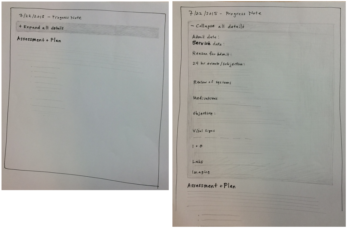
During one of these meetings I sat with Dr. Matt Vanderloo, and together we sketched out an idea for an accordion-style note that collapsed the less-important parts of the note; this became the foundation of our team’s solution.
Early sketches
Ongoing collaboration with clinical team members
Our working project team ultimately narrowed to me, Epic analyst Jillian Charles, and three clinicians: two pediatric hospitalists, Dr. Keith Robinson and Dr. Paul Rosenau, and brilliant chief internal medicine resident (at the time), Dr. Rachel McEntee. We met frequently to review drafts, gather clinical input, and discuss our roll-out plan. It was especially important that our proposed note template align with their workflow, and they brought questions back to their teams as needed.
Workshops at department meetings
I attended the hospitalist department meetings multiple times, presented our progress, and gathered feedback and concerns. This helped us raise excitement about the new note template and get leaders on board.
Result: successful roll-out
Ultimately this was a successful roll-out with high acceptance rate of the new note template, and a 24% reduction in note length.
Feedback from involved clinicians:
“This new note template rollout was the best I’ve experienced.” (–Chief Medicine Hospitalist)
“The note format looks great. It seems to be well received by my medicine colleagues. I appreciated being included in the project.” (–Medicine Resident who helped with initial sketches)
Health history and symptom visualization tool
Yes, it’s my own startup, Pictal Health. Throughout my startup journey I’ve talked with countless patients, lots of people involved in the business of healthcare, and I’ve worked with many clinicians along the way, in the following ways:
Usability testing
I’ve done usability testing sessions with specialists, primary care providers,, care coordinators, and others. In the summer of 2022, I went deep on mental and behavioral health and had a number of productive feedback sessions with these types of providers. For these sessions, I either used a Figma prototype, or our live prototype.
I learned a ton from them - from little usability issues, to the fact that many times they need to see ‘lists’ of information instead of timelines. Clinicians are expected to perform in a consistently high-stress environment, so we want to do whatever we can to bring calmness and clarity.
Grant/project collaboration
During a summer-long project with the VA, I did a pilot with 10 patients and their psychiatrist. I collaborated heavily with the psychiatrist and a resident to plan our process and determine how we would measure success. It was great fun.
I applied to the SBIR grant and put my heart and soul into it, but unfortunately did not get it (yet.) I had the pleasure of working with Maniraj Jeyaraju, a super smart doctor, on my application.
You can find the larger Pictal Health business/design case study here.


