Spotlight: Health & data visualization
In 2012, I came to my healthcare design work with two things: a complex health history (having spent 20 years dealing with multiple autoimmune conditions) and a robust interest in data visualization.
A few years previously I’d interned at VMware, where I conceptualized, designed and tested an app concept to help IT admins monitor virtual machines. The project won ‘best intern project’ and was the company’s first foray into mobile.

It looks retro now, but people got excited about this way back then.
As I started my design career, I also started hanging out at a conference called Eyeo, getting inspiration from the data visualization ‘greats’ in the early 2010s.
In 2011 my life and interests collided, as I found myself in the midst of a years-long diagnostic odyssey. I created my first health history timeline to communicate my story more efficiently, and this became the foundation of my startup Pictal Health:
Trajectories of 2 key symptoms over my life span, with milestones sprinkled in.
I’ve now spent 11+ years focusing on design in healthcare, and during that time I’ve worked on many projects at the intersection of health data and visualization. It has been a joy.
Simple health data display
2018
For a health data startup (since acquired), I designed a calm, organized clinical view of health data that was extracted from source files. I worked closely with the Chief Medical Officer through this process, and I tested the display with some other clinicians to ensure we were on the right track. I worked with my collaborator Alli Berry on colors and spacing, while collaborating with the product manager on deeper data and system requirements.

Lab test results
2013-2014
With a startup (since pivoted,) I worked to make lab test results more user-friendly for doctors and patients. My collaborator Jackson Latka led the visual design, and I collaborated full-time with the product team. We worked on a physician-facing responsive web app, where out of range results received more visual weight:

We also worked on multiple patient-facing apps, one of which is below. There are things I would change about this work today: less red (a guilty or alarming color for patients,) and better red-green differentiation in the graph.

I learned a heck of a lot about reference ranges and variability therein, the difficulties of patient identification, and I got to work with a great product team along the way.
Remote monitoring of digital health data
2014-2016
I spent a couple years working intensely on remote monitoring with the nonprofit Open mHealth and subsequent spin-out company Overlap Health. Our goals were a) make it as easy as possible for patients to get connected and track digital health metrics, and b) make this data as useful as possible in a clinical setting.

Clinicians told us that in some cases, the numbers were more important than the graphs. After many iterations, our ‘clinician dashboard’ looked like the below: bold numbers indicating average over a certain time period, plus sparkline or subtle graphs to show trends.

We learned that ‘minutes of moderate activity’ was important from a clinical standpoint, so we played that up in our activity designs.

Through this work, I tried to use color to bring focus to things that needed attention, and let everything else fall to the background. In our blood pressure graphs, for example, we tried coloring the ‘out of range’ area.

We played around with different ways of showing averages - below is an exploration of ‘average by hour’ for data like heart rate, blood pressure or blood sugar.

What could medication adherence look like, assuming a patient is using a connected medication dispensor? (As a patient, I always have trouble with words like ‘adherence’ or ‘compliance,’ but I know it’s an important topic.) We tried highlighting lower adherence rates:

And we highlighted times when the patient missed meds.

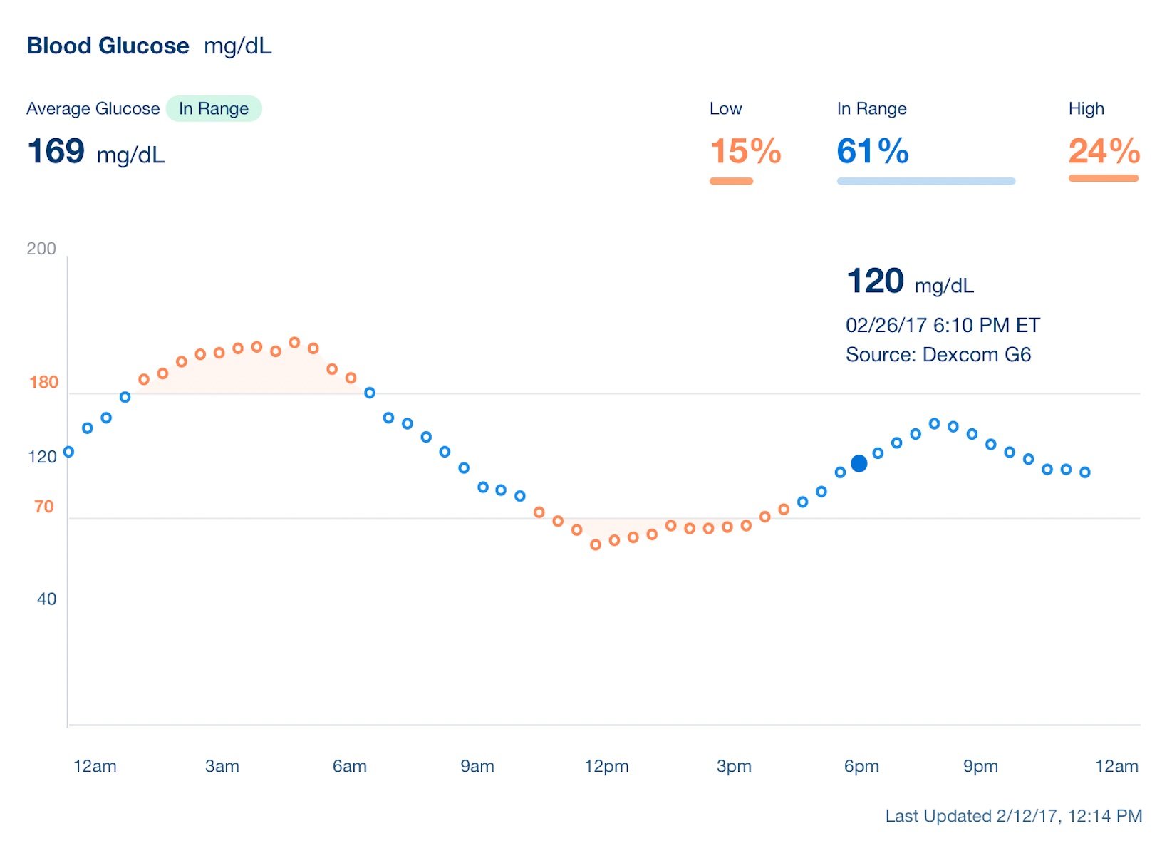
With Overlap, we got to explore blood glucose in more detail, which was fun and new for me.

Health history and symptom visualization
2011-present
As someone who has had difficulty articulating my many symptoms and complex history, I have dabbled for years in presenting this information visually. I started doing this for myself, and in 2018 I started Pictal Health to bring this to others. I refined the process after working with 65 clients to gather and visualize their health. This is not ‘data visualization’ technically - at least not yet - but more like story and symptom visualization, qualitative, unstructured information that is difficult for clinicians and patients to see. Here are just a few examples.


I have been working with team member Chris to create a web app timeline creation tool - which has just launched in summer 2023. This work has consumed years of my life, and it’s been incredibly meaningful. Check out the full case study here.
